Modelling, visualization and analysis with the `grainscape` package
Paul Galpern1
Alex M. Chubaty2
Source:vignettes/grainscape_vignette.Rmd
grainscape_vignette.RmdVisual table of contents
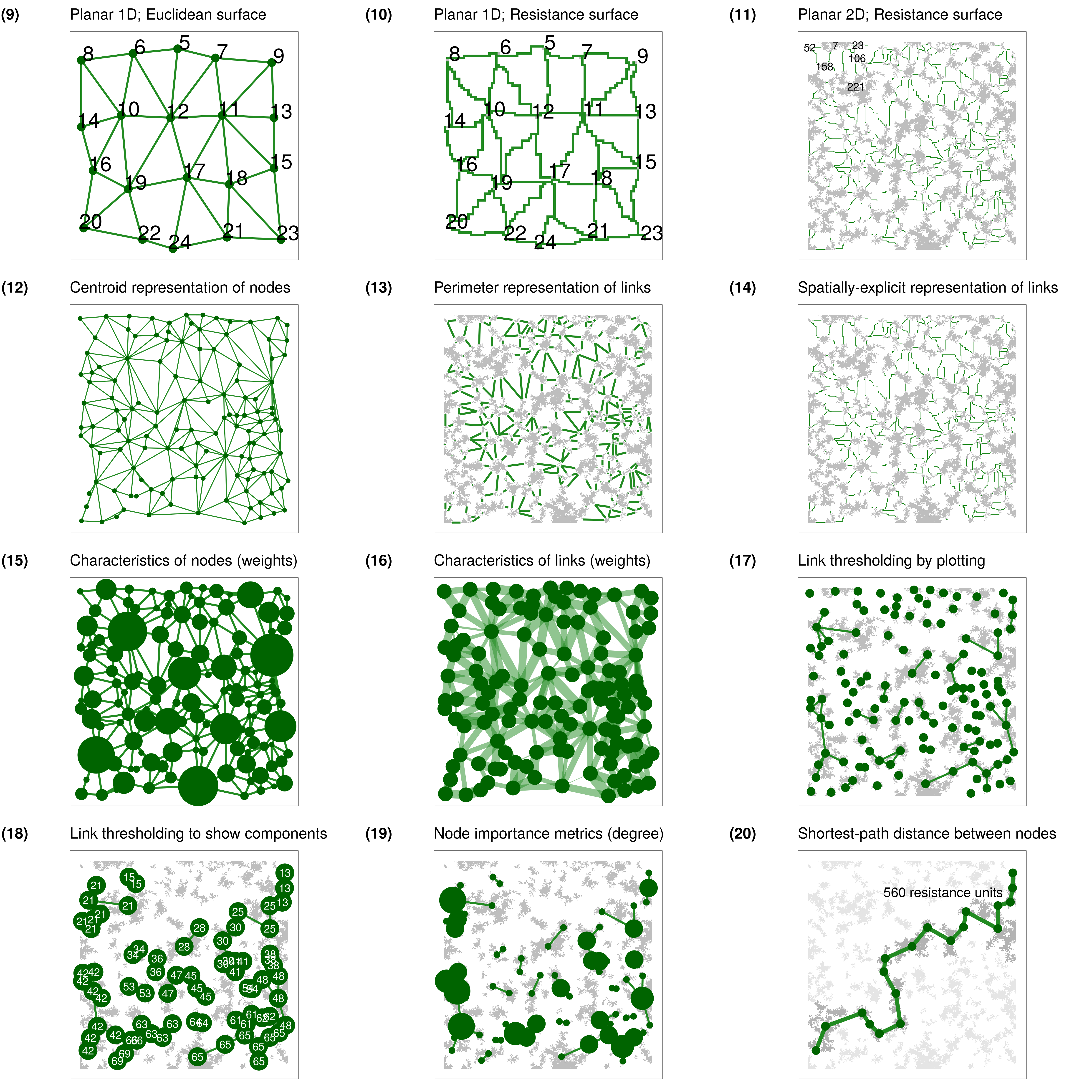
grainscape. Numerals refer to figures.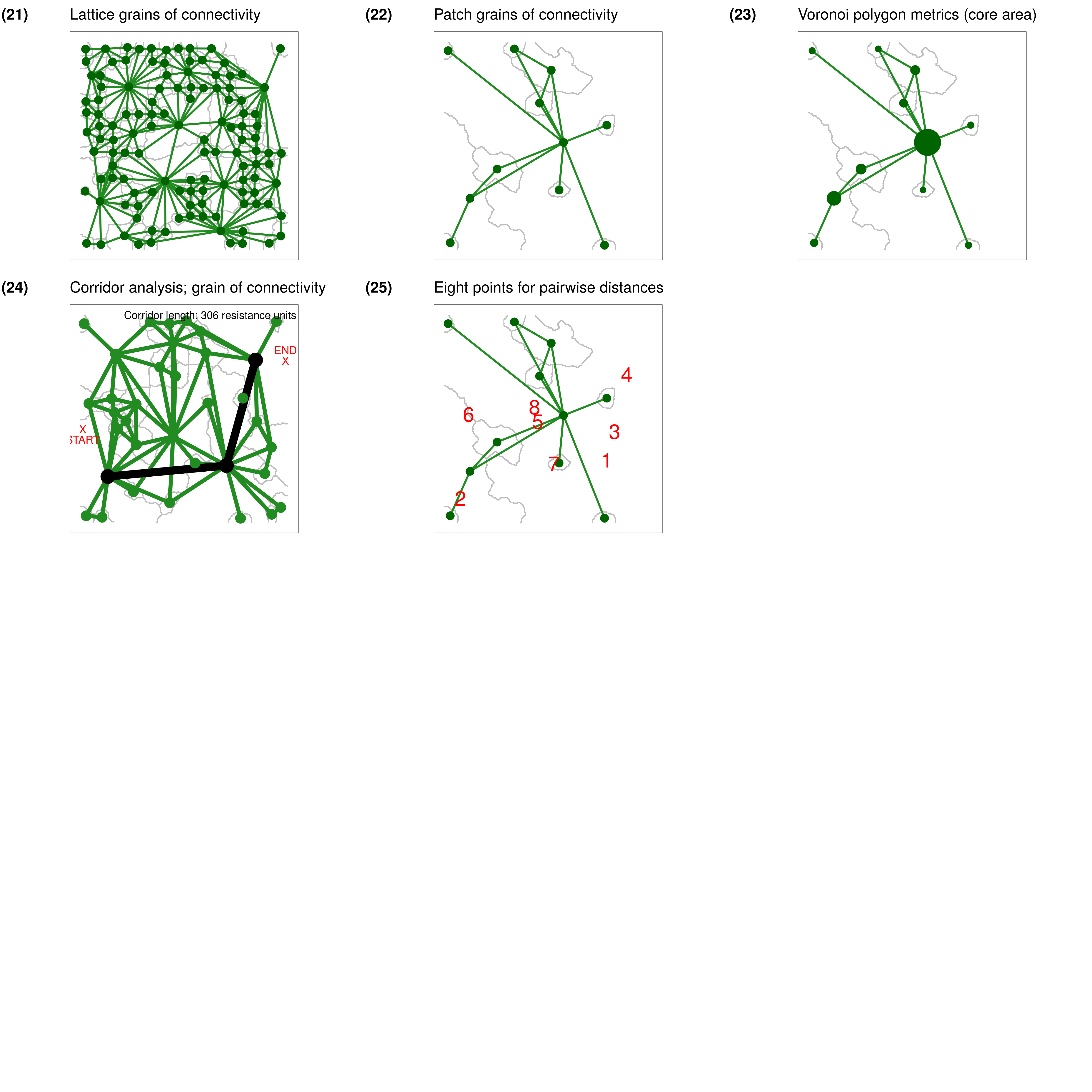
grainscape. Numerals refer to figures.Introduction
The grainscape package enables a range of analyses
within R that have applications across the disciplines of ecology,
conservation biology and geography. For example, networks extracted by
grainscape can be used to model habitat connectivity or
evaluate protected area network resilience. These networks can be
modelled, visualized and analyzed at multiple spatial scales. A more
general contribution is the ability to extract Voronoi tessellations on
a continuous resistance surface. This has applications in spatial
analysis, for example to model service areas where travel times or the
cost of movement vary continuously across space.
The inspiration for the grainscape package is the
analysis of landscape connectivity. The approach comes from the
patch-based landscape graphs tradition (Urban and
Keitt 2001; Fall et al. 2007; Galpern, Manseau, and Fall 2011)
where a mathematical graph or network is used to represent the
relationships among habitat patches. In grainscape these
could equally be protected areas where connectivity for terrestrial
ecological processes is of interest, such as ranging behaviour or plant
and animal dispersal.
There are two types of models produced by grainscape.
The first, a minimum planar graph (Fall et al.
2007) is an efficient approximation of the potential for
connectivity among a set of focal two dimensional nodes. In landscape
connectivity modelling these nodes might be habitat patches or protected
areas.
The second model type is the grain of connectivity, which is based on the minimum planar graph, but extends it in a way that may be useful for scaling (Galpern, Manseau, and Wilson 2012; Galpern and Manseau 2013a, 2013b). Again, using landscape connectivity as an example, these grains can be used for sensitivity analyses of protected area connectivity, or to model highly mobile terrestrial animals, such as ungulates and carnivores, where the habitat patch may be not be a discrete and definable feature but is rather defined probabilistically. The model achieves this by using the complement of the minimum planar graph, a Voronoi tessellation of the map, and modelling the relationships among polygons in a Voronoi tessellation rather than discrete patches. This approach has been shown to improve the ability to model movements of highly-mobile organisms (Galpern, Manseau, and Wilson 2012). For example, grains of connectivity provides continuous coverage of the entire landscape surface in a way that a typical patch-based network does not. It also permits the examination of connectivity at multiple scales, which can accommodate uncertainty in how species may perceive landscape features (Galpern and Manseau 2013a, 2013b).
The grainscape package provides functions to extract the
minimum planar graph and create two types of grains of connectivity:
patch and lattice forms. This reference begins by introducing these two
model types, and concludes by demonstrating a variety of
grainscape models, visualizations, and analyses using a
consistent visual style. Code and commentary are included throughout.
All analyses are reproducible with data distributed with this
package.
Modelling with grainscape
In this section we demonstrate how to prepare rasters for modelling
with grainscape. Data provided with the package are used as
examples. The input to grainscape is a resistance surface,
and optionally a second raster describing the focal regions on a raster
which will serve as nodes in a network. The resistance surface may
represent the resistance to the flow of some ecological process of
interest, and the nodes, focal regions where this process has an origin.
A typical application is to model connectivity of landscapes for
dispersal of terrestrial animals. Here, the resistance surface models
the costs to movement, and the nodes habitat from which animals may
disperse. Many other applications of nodes and resistance surfaces are
equally valid and could represent both ecological and non-ecological
processes.
Inputs to grainscape are typically raster images.
Rasters may represent a geographical region, and ideally have a
projected coordinate system. This raster must contain cells with
value >= 1, where values are real or integers. If data
are missing, cells must have value == NA (e.g,
commonly in the boundary cells of an irregularly shaped region of
interest).
The following are key packages required to complete analyses with
grainscape. The igraph package provides
network analytical functions, while raster provides the the
data structure and raster analytical functions upon which
grainscape depends to manage data. Finally model and
analytical products are compatible with visualizing using the popular
ggplot2 idiom.
Model 1: The minimum planar graph
The minimum planar graph (hereafter MPG) is a spatial representation of a graph or a network that provides an efficient approximation of all possible pairwise connections between graph nodes (Fall et al. 2007). In graph-based landscape connectivity analyses, graph nodes have typically been patches of habitat that are demonstrably important for the species in question (Fall et al. 2007). In the following example we will continue the habitat connectivity modelling objective for clarity, but emphasize that this is not the only task to which these methods can be applied.
An MPG representing habitat connectivity has links that model the possibility for organism movement and dispersal between spatially-adjacent habitat patches. In some cases spatially-adjacent patches may not be linked, if the shortest connection between them can be made through a third patch. In practice, this property means that the MPG can be used to make a simple and easily visualized picture of how a set of habitat patches is connected. The alternative, the complete graph, can quickly become challenging to interpret because these may contain a dense set of graph links making the pattern difficult to discern. A second advantage of the MPG is the much reduced set of graph links; this can be valuable where computational efficiency is important, and essential where the number of habitat patches being modelled numbers in the thousands.
However, there are some types of connectivity analyses where the MPG approximation of the complete graph is not appropriate. For example, assessing community structure within a landscape patch network (i.e., finding sets of patches that are densely connected) is not possible as redundant connections have been removed intentionally. Equally, the MPG is a poor choice for prioritizing the influence of a patch for connectivity, the objective in a number of landscape graph studies (e.g., Pascual-Hortal and Saura 2006). Please see Galpern, Manseau, and Fall (2011) for further discussion of these limitations and of the MPG.
Step 1: Preparing the resistance surface
The MPG has typically been constructed using shortest path links between the perimeters of two dimensional node patches. In habitat connectivity terms, this implies that landscape structure in the “matrix” between patches is influencing movement, and that the organism in question is on average minimizing its costs when moving through this matrix (an assumption possibly appropriate for terrestrial animals, and terrestrial animal-dispersed plants). Equally, MPGs can be constructed using Euclidean links, where the only influence of the matrix on movement is the effect of spatial separation (i.e., distance it presents between neighbouring habitat).
Here, we illustrate just the case where links are shortest paths on a resistance surface. Euclidean links can be produced by passing a uniform cost surface (a constant raster), and a raster describing the patches. An example of this is given later in the document.
We begin by loading a landscape raster distributed with the package.
Note that any raster format readable using the raster
package can be used here. The .asc format rasters
distributed with the package are ESRI ArcASCII format.
patchy <- raster(system.file("extdata/patchy.asc", package = "grainscape"))Then, for convenience, we use R to turn this raster into a resistance
surface. In this example we will assume the feature class 1
(i.e., cells with value == 1) are the patches. We
will set them to resistance value also equal to 1
(i.e., no additional resistance to movement than distance
alone). The river, feature class 2, is assigned the highest resistance
of 10. Other features are assigned values in between. The
parameterization of resistance surfaces for landscape connectivity
modelling is itself a big topic (Zeller,
McGarigal, and Whiteley 2012). The matrix isBecomes
describes the transformation from feature class to resistance surface.
The result is shown in .
## Create an is-becomes matrix for reclassification
isBecomes <- cbind(c(1, 2, 3, 4, 5), c(1, 10, 8, 3, 6))
patchyCost <- reclassify(patchy, rcl = isBecomes)
patchyCost_df <- ggGS(patchyCost)
patchyCost_df$value <- as.factor(patchyCost_df$value)

## Plot this raster using ggplot2 functionality
## and the default grainscape theme
ggplot() +
  geom_raster(
    data = patchyCost_df,
    aes(x = x, y = y, fill = value)
  ) +
  scale_fill_brewer(
    type = "qual", palette = "Paired",
    direction = -1, guide = "legend"
  ) +
  guides(fill = guide_legend(title = "Resistance")) +
  theme_grainscape() +
  theme(legend.position = "right")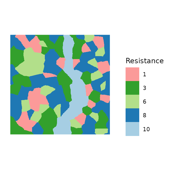
Input raster resistance surface to create the minimum planar graph (MPG). Features with value of 1 (red) will be the patches in the network. A river (light blue) has the highest resistance in this example.
Step 2: Extracting the MPG
With a resistance surface in hand the next step is to create the MPG.
Basic use of the function, MPG() to do this is shown here.
For simplicity we assume that all areas with the resistance value equal
to 1 on the raster are patches. This is a convenient short
cut when patches are the only part of the raster where resistance is
equal to geographic distance. However, in many applications focal
patches will be a subset of these areas, or represent areas with
multiple resistance values. These can be accommodated by passing a patch
raster to the patch= parameter, created using any method.
Equally patches below a certain size could be filtered by passing the
patch raster to patchfilter() first.
patchyMPG <- MPG(patchyCost, patch = (patchyCost == 1))Step 3: Quick visualization of the MPG
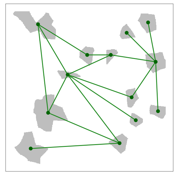
A quick way to visualize the MPG is provided by the plot
method in grainscape. This appears in .
plot(patchyMPG, quick = "mpgPlot", theme = FALSE)![\label{fig:mpgplot}A quick visualization of the minimum planar graph (MPG). Grey areas are patches (nodes) in the graph, and green lines are links showing the shortest paths between the perimeters of the patches on the resistance surface. In depth discussion of how the MPG is generated can be found elsewhere [@Fall:2007eo].](grainscape_vignette_files/figure-html/figure_04-1.png)
A quick visualization of the minimum planar graph (MPG). Grey areas are patches (nodes) in the graph, and green lines are links showing the shortest paths between the perimeters of the patches on the resistance surface. In depth discussion of how the MPG is generated can be found elsewhere (Fall et al. 2007).
Step 4: Reporting on the MPG
Following extraction, the MPG is available as an igraph
object (see patchyMPG@mpg) and can be analyzed using any of
the functions in this package. A quick way to report on the structure of
the graph in tabular format is provided by the function
graphdf():
## Extract tabular node information using the graphdf() function
nodeTable <- graphdf(patchyMPG)[[1]]$v

## Render table using the kable function,
## retaining the first three rows
kable(nodeTable[1:3, ], digits = 0, row.names = FALSE)| name | patchId | patchArea | patchEdgeArea | coreArea | centroidX | centroidY |
|---|---|---|---|---|---|---|
| 5 | 5 | 3995 | 388 | 3607 | 81 | -33 |
| 7 | 7 | 1682 | 189 | 1493 | 356 | -28 |
| 9 | 9 | 937 | 154 | 783 | 302 | -54 |
## Extract tabular link information using the graphdf() function
linkTable <- graphdf(patchyMPG)[[1]]$e

## Render table using the kable function,
## retaining the first three rows
kable(linkTable[1:3, ], digits = 0, row.names = FALSE)| e1 | e2 | linkId | lcpPerimWeight | startPerimX | startPerimY | endPerimX | endPerimY |
|---|---|---|---|---|---|---|---|
| 24 | 37 | 1 | 45 | 315 | -259 | 314 | -246 |
| 36 | 37 | 2 | 90 | 342 | -273 | 360 | -262 |
| 9 | 12 | 3 | 120 | 289 | -70 | 277 | -97 |
The output in shows the structure of the nodes (vertices) and their
attributes under the list element $v as well as the
structure of the graph in the form of an link list (i.e., pairs
of nodes e1 and e2 that are connected) and
associated link (edge) attributes under the list element
$e. Note that only the first three lines of each has been
reproduced here. Please see the manual for the interpretation of the
attributes.
Step 5: Thresholding the MPG
A frequent step in the analysis of a network is to threshold it into a series of clusters or components representing connected areas (Urban and Keitt 2001; Galpern, Manseau, and Fall 2011; Galpern, Manseau, and Wilson 2012). This has sometimes been called a scalar analysis (Brooks 2003).
The function threshold() provides a way to conduct a
scalar analysis at multiple scales. Here we ask for 5 thresholds, and
the function finds five approximately evenly-spaced threshold values in
link length.
scalarAnalysis <- threshold(patchyMPG, nThresh = 5)

## Use kable to render this as a table
kable(scalarAnalysis$summary,
  caption = paste(
    "The number of components ('nComponents') in the",
    "minimum planar graph at five automatically-selected",
    "link thresholds ('maxLink)."
  )
)| maxLink | nComponents |
|---|---|
| 0.00 | 13 |
| 313.25 | 5 |
| 626.50 | 1 |
| 939.75 | 1 |
| 1253.00 | 1 |
The $summary of this analysis can be plotted to explore
scales of aggregation in the landscape. shows a scalar analysis of this
landscape with 100 thresholds, where the response variables is the
number of components or sub-graphs created by the thresholding.
scalarAnalysis <- threshold(patchyMPG, nThresh = 100)
ggplot(scalarAnalysis$summary, aes(x = maxLink, y = nComponents)) +
  geom_line(colour = "forestgreen") +
  xlab("Link Threshold (resistance units)") +
  ylab("Number of components") +
  scale_x_continuous(breaks = seq(0, 1000, by = 100)) +
  scale_y_continuous(breaks = 1:20) +
  theme_light() +
  theme(axis.title = element_text())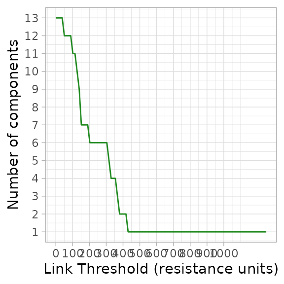
A scalar analysis at 100 thresholds of the MPG in . When the landscape is a single component at higher link thresholds all patches are completely connected. As an example, an organism able to disperse 250 resistance units would experience this landscape as six connected regions.
Other independent variables describing the components (e.g.,
area of patches) could, of course, be calculated by processing the
thresholded graphs scalarAnalysis$th and their attributes
using the igraph function components().
Step 6: Visualizing a thresholded graph
Consider an organism able to disperse a maximum of 250 resistance units. According to this organism would experience this landscape as 6 connected regions. This is visualized in .
links_df <- ggGS(patchyMPG, "links") |>
  dplyr::filter(lcpPerimWeight >= 250)

ggplot() +
  geom_raster(
    data = ggGS(patchyMPG, "patchId"),
    mapping = aes(x = x, y = y, fill = value > 0)
  ) +
  scale_fill_manual(values = "grey") +
  geom_segment(
    data = links_df,
    mapping = aes(
      x = x1, y = y1, xend = x2, yend = y2,
      colour = as.factor(lcpPerimWeight)
    )
  ) +
  scale_colour_manual(values = rep("forestgreen", nrow(links_df))) +
  geom_point(
    data = ggGS(patchyMPG, "nodes"),
    mapping = aes(x = x, y = y),
    colour = "darkgreen"
  )
The thresholded MPG depicted with a link length of 250 resistance units. An organism that can disperse a maximum of 250 resistance units would experience this landscape as 6 connected regions in the depicted spatial configuration. Note that the plotting has been customized to emphasize which patches are connected. This was done by plotting links with less than the threshold length from the centroids of patches
Step 7: Next steps
With the MPG in hand, several additional types of analyses are possible. Grains of connectivity (GOC), the subject of the next section, is an example of using the MPG and its complement the Voronoi tessellation.
When programming your own analyses in R based on the MPG it is
helpful to observe that the patchyMPG@patchId and
patchyMPG@lcpLinkId rasters contain the numerical IDs of
the patches (nodes) and links respectively. These are are also contained
as attributes in the igraph object
patchyMPG@mpg. Using these three data objects together
gives flexibility to visualize any graph analysis. Additional example
visualizations and analyses are contained later in this document.
Model 2: Patch grains of connectivity
Grains of connectivity (hereafter GOC) was initially developed in three papers (Galpern, Manseau, and Wilson 2012; Galpern and Manseau 2013b, 2013a). Please refer to these papers for much more detail on this method. In summary, grains of connectivity describes a tessellation of functionally-connected regions of the map. In this example we present these in the context of modelling landscape connectivity for highly-mobile terrestrial organisms that are not obligate patch occupants.
Step 1: Begin with a MPG
Here, we repeat the steps as before for the same patchy
resistance surface explored in the MPG examples. Any of the variations
imaginable for the MPG modelling can provide a valid basis to build a
GOC.
## Load the patchy raster distributed with grainscape
patchy <- raster(system.file("extdata/patchy.asc", package = "grainscape"))

## Create an is-becomes matrix for reclassification
isBecomes <- cbind(c(1, 2, 3, 4, 5), c(1, 10, 8, 3, 6))
patchyCost <- reclassify(patchy, rcl = isBecomes)

## Create the MPG model using cells = 1 as patches
patchyMPG <- MPG(patchyCost, patch = (patchyCost == 1))
Step 2: Exploring the Voronoi tessellation
Before we build the GOC graph, we should explore the essential
building block of GOC, which is the Voronoi tessellation. This
particular Voronoi tessellation was first described elsewhere (Fall et al. 2007) and is the complement of the
MPG. It is identified by finding the region of proximity in resistance
units around a resource patch. In contrast to the well-known Voronoi
tessellation where the generators are points and distance is Euclidean,
this tessellation uses two-dimensional patches as generators and
distance is calculated in cost or resistance space. The tessellation is
found in grainscape using a marching algorithm implemented
in C++.
The Voronoi tessellation is extracted as part of finding the
MPG(). A plot with the Voronoi tessellation and the patches
superimposed is shown in .
patchPlusVoronoi <- patchyMPG@voronoi
patchPlusVoronoi[patchyMPG@patchId] <- 0

ggplot() +
  geom_raster(data = ggGS(patchPlusVoronoi), aes(x = x, y = y, fill = value))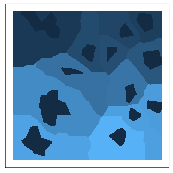
A Voronoi tessellation. This is the complement of the MPG. The patches (darkest blue) are used as generators, and regions of proximity (polygons of different colours) are found in cost or resistance units. The method was first described by Fall et al. (2007).
Step 3: Building GOC models
GOC analysis is essentially a scalar or thresholding analysis (see
threshold() and above) except the graph being thresholded
is one of Voronoi polygons rather than patches. In particular, it is the
MPG of Voronoi polygons that is thresholded. As links are added, and
Voronoi polygons linked, the relevant polygons are combined describing
larger connected regions. An additional step is that the links
connecting a pair of polygons are the mean value of all links connecting
any patches in each of the two polygons from the MPG (Galpern, Manseau, and Wilson 2012).
The function GOC() builds GOC models at multiple
thresholds. As with threshold() we can specify the number
of thresholds, or grains of connectivity models, we want to create using
the nThresh parameter.
patchyGOC <- GOC(patchyMPG, nThresh = 10)Step 4: Visualizing a GOC model
To get a quick sense of the connected regions described by a GOC
model at a given threshold (or scale of movement) we can use the
function grain(). This example uses the functions plotting
mechanism to plot the 6th threshold in the patchyGOC
object. shows the resulting plot.
## Extracting voronoi boundaries...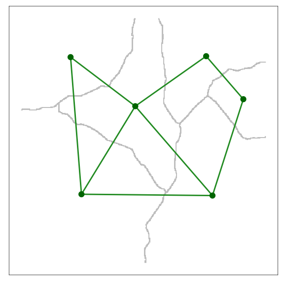
A visualization of a GOC model. In this case it is the 6th scale or threshold extracted. Voronoi polygons imply regions that are functionally-connected at the given movement threshold.
The remainder of this document serves as a reference to modelling,
visualization and analysis using the grainscape package.
Please refer to the visual table of contents.
Landscape networks with 1D and 2D nodes
Modelling
Planar network with one-dimensional nodes on a Euclidean surface
One-dimensional nodes (i.e., points) can represent map
locations of an ecological or spatial process of interest. While the
Euclidean distance between these points is easily calculated in R using
the dist() function, we may be interested in the path
distance to just the immediate neighbours of each point. A
planar network extracted on a Euclidean resistance surface can
be used to identify which nodes are neighbours and find their pairwise
distances (Fall et al. 2007; Galpern, Manseau,
and Fall 2011). In grainscape a Euclidean resistance
surface is simply a resistance surface where all values are
= 1)
## Make a new resistance raster of 400 by 400 cells
## with a coordinate system that corresponds to cells
res <- raster(xmn = 0, xmx = 100, ymn = 0, ymx = 100, resolution = 1)

## Assign all values to 1
res[] <- 1

## Create 20 "random" points representing nodes,
## (i.e. the loci of a process of interest)
pts <- data.frame(
  x = rep(seq(10, 90, length.out = 5), 4),
  y = seq(10, 90, length.out = 4)
) +
  cbind(runif(20) * 10, runif(20) * 10)

## Represent these on a patch raster
## by duplicating the resistance raster and
## setting the relevant cells to 1
patchPts <- res
patchPts <- setValues(patchPts, 0)
patchPts[cellFromXY(patchPts, pts)] <- 1

## Extract the MPG
mpg <- MPG(res, patchPts)

## Plot the result using the quick 'network' visualization
## setting and add labels (dodging them by 3 to the upper-right)
figure09 <- plot(mpg, quick = "network", theme = FALSE) +
  geom_text(
    data = ggGS(mpg, "nodes"),
    aes(x = x + 3, y = y + 3, label = patchId)
  ) +
  ggtitle("Planar 1D; Euclidean surface")
figure09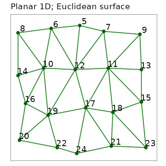
A planar network with one-dimensional point nodes extracted using
grainscape. Nodes are represented as points and labelled
with their patchId. Links are line segments among nodes.
The distance between nodes can be extracted from the objects. Note how the distances are integers, because they do not represent the Euclidean distance, but rather the accumulated path distance among nodes. On this particular raster one cell equals one unit of distance, therefore distances are the count of cells separating nodes.
## Here we show the first five rows of the link attribute table
## extracted from the mpg object. This shows selected columns,
## using the formatting function kable()
neighbours <- graphdf(mpg)[[1]]$e[, c(1, 2, 4)]
neighbours <- neighbours[order(neighbours[, 1]), ][1:5, ]
names(neighbours) <- c("Node 1", "Node 2", "Path distance (Euclidean)")
kable(neighbours, row.names = FALSE)| Node 1 | Node 2 | Path distance (Euclidean) |
|---|---|---|
| 5 | 7 | 19 |
| 5 | 6 | 20 |
| 5 | 12 | 32 |
| 6 | 8 | 24 |
| 6 | 10 | 31 |
Planar network with one-dimensional nodes on a non-Euclidean resistance surface
Similarly, when the distance among points, or nodes, is best
explained by some cost or resistance, neighbour distance can be modelled
in an identical manner, leveraging the planarity of the network. The
only difference in the code from the previous 1D Euclidean example is
the use of the resistance surface rather than a raster consisting only
of the value 1. We will borrow objects made in previous
steps to keep the code concise.
## Add some cost values to the resistance
## surface we used in the last step
## Here we use random integers >= 2
res2 <- res
res2[] <- floor(runif(ncell(res2)) * 10 + 1)

## Extract the minimum planar graph using the
## raster made previously which represents the points only
mpg <- MPG(res2, patchPts)

## Plot the result using the quick 'mpgPlot' visualization
## setting and add labels (dodging them by 3 to the upper-right)
## This demonstrates the non-linear paths.
figure10 <- plot(mpg, quick = "mpgPlot", theme = FALSE) +
  geom_text(
    data = ggGS(mpg, "nodes"),
    aes(x = x + 3, y = y + 3, label = patchId)
  ) +
  ggtitle("Planar 1D; Resistance surface")
figure10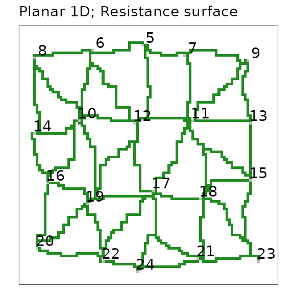
A planar network with one-dimensional nodes extracted on a resistance
surface. Nodes are represented by grey-coloured cells and labelled with
their patchId. Links are green paths between nodes, shown
in a spatially-explicit representation.
The distances between nodes are still integers, and they also represent a path distance. Now, this is rather the shortest accumulated path distance through the resistance surface between nodes. Once again, their metric is an integer because resistance values were also integers. The table below demonstrates that the non-Euclidean path distance is longer among the same pairs of nodes, and they are not perfectly correlated, as we expect.
## Here we show the first five rows of the link attribute table
## extracted from the mpg object. This shows selected columns, using
## the formatting function kable()
resNeighbours <- graphdf(mpg)[[1]]$e[, c(1, 2, 4)]
resNeighbours <- resNeighbours[order(resNeighbours[, 1]), ][1:5, ]
comparison <- cbind(neighbours, resNeighbours)[, -c(4, 5)]
names(comparison)[4] <- c("Path distance (Resistance)")
kable(comparison, row.names = FALSE)| Node 1 | Node 2 | Path distance (Euclidean) | Path distance (Resistance) |
|---|---|---|---|
| 5 | 7 | 19 | 74 |
| 5 | 6 | 20 | 110 |
| 5 | 12 | 32 | 123 |
| 6 | 8 | 24 | 106 |
| 6 | 10 | 31 | 126 |
Planar network with two-dimensional nodes on a non-Euclidean resistance surface (minimum planar graph)
This is the minimum planar graph (MPG) (Fall
et al. 2007), and the inspiration for the grainscape
package. Please see the first part of this document for a more thorough
presentation of the MPG. Andrew Fall and colleagues originally
articulated this graph theory-based model as a spatial graph.
It was an approach that built a graph (or a network) of patches and,
critically, it was aware of a spatially-explicit landscape. This
incorporated multiple landscape elements that might be visible on a map,
such as the shape, size and configuration of two-dimensional node
patches as well as continuous geographic variation in the spaces between
the nodes (i.e., the matrix). In a minimum planar graph (MPG)
the matrix presents resistance to connectivity and influences the paths
and therefore the lengths of the links. The shape, size and
configuration of patches with respect to their neighbours that
influences where on the patch perimeters these links begin and end. The
value of using patch perimeters rather than centroids is that it
potentially improves the estimation of the shortest paths among
patches.
An MPG can be understood as a planar network (i.e., no links “cross” nodes), that provides an efficient representation of connections among neighbouring nodes. Its nodes are two-dimensional patches and its links are the shortest paths through a resistance surface.
The following example uses a more realistic resistance surface based on a simulated land cover raster.
## Load a land cover raster distributed with grainscape
frag <- raster(system.file("extdata/fragmented.asc", package = "grainscape"))

## Convert land cover to resistance units
## Use an "is-becomes" reclassification
isBecomes <- cbind(c(1, 2, 3, 4), c(1, 5, 10, 12))

fragRes <- reclassify(frag, rcl = isBecomes)

## Extract a network using cells = 1 on original raster
## as the focal patches or nodes
patches <- (frag == 1)
fragMPG <- MPG(fragRes, patch = patches)

## Plot the minimum planar graph with node labels for several
## focal nodes of interest
figure11 <- plot(fragMPG, quick = "mpgPlot", theme = FALSE) +
  geom_text(
    data = ggGS(fragMPG, "nodes"),
    aes(
      x = x, y = y,
      label = ifelse(patchId %in% c(7, 23, 52, 106, 158, 221),
        patchId, ""
      )
    ),
    size = 2
  ) +
  ggtitle("Planar 2D; Resistance surface")
figure11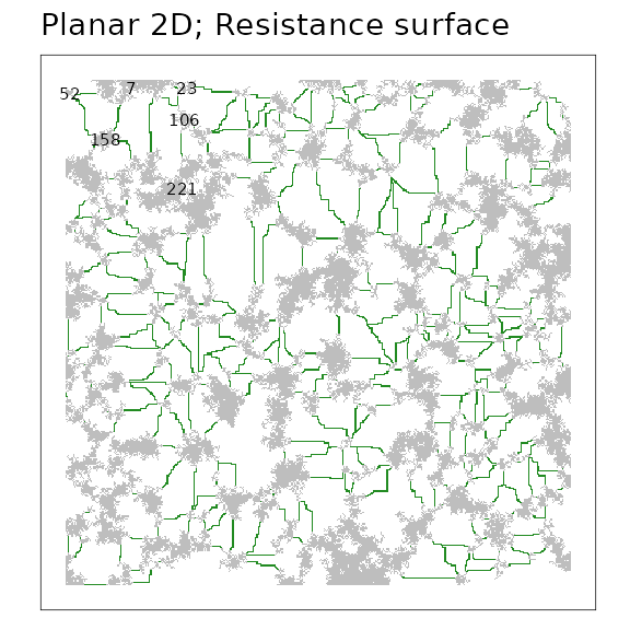
A minimum planar graph (MPG) of a simulated resistance surface. Focal
patches are grey regions and green lines indicate spatially-explicit
links among patches. Several patches are labelled with their numerical
patchId.
The distances from the perimeters of the nodes along the paths of the links (green in figure) are available in the output object in the same manner as before.
## Here we show only patch 7 and its neighbours that are labelled on
## the network using the formatting function kable().
fragNeighbours <- graphdf(fragMPG)[[1]]$e[, c(1, 2, 4)]
fragNeighbours <- fragNeighbours[order(fragNeighbours[, 1]), ][1:5, ]
names(fragNeighbours) <- c("Node 1", "Node 2", "Path distance (Resistance)")
kable(fragNeighbours, row.names = FALSE)| Node 1 | Node 2 | Path distance (Resistance) |
|---|---|---|
| 7 | 23 | 27 |
| 7 | 52 | 90 |
| 7 | 106 | 135 |
| 7 | 158 | 137 |
| 7 | 221 | 235 |
Visualization
Centroid representation of nodes
Where nodes represent two-dimensional regions (e.g, patches, protected areas) it can be convenient to visualize nodes as points plotted at the centroid location of the region (Urban and Keitt 2001; Galpern, Manseau, and Fall 2011). While the links themselves may be measured from patch perimeters, or quantities related to the nodes summarized across patch areas, visualization can be improved by omitting complexities such as these. Cases where centroid node representation may be justified include: (1) mapping of the topology of a complex network; (2) mapping the number and distribution of links; (3) mapping the properties of the nodes (see example below); or, (4) where a large plotting extent makes regions hard to see.
This example uses the resistance surface and minimum planar graph
from a previous example (fragMPG).
## Plot the minimum planar graph using centroid nodes
## A single line of code will do this as follows:
## plot(fragMPG, quick = "network")

## However the following approach gives more control,
## allowing reduction of the size of the nodes to avoid crowding
figure12 <- ggplot() +
  geom_segment(
    data = ggGS(fragMPG, "links"),
    aes(
      x = x1, y = y1, xend = x2, yend = y2,
      colour = "forestgreen", size = 0.25
    )
  ) +
  geom_point(
    data = ggGS(fragMPG, "nodes"),
    aes(x = x, y = y, colour = "darkgreen", size = 0.5)
  ) +
  scale_colour_identity() +
  scale_size_identity() +
  ggtitle("Centroid representation of nodes")
## Warning: Using `size` aesthetic for lines was deprecated in ggplot2 3.4.0.
## ℹ Please use `linewidth` instead.
## This warning is displayed once every 8 hours.
## Call `lifecycle::last_lifecycle_warnings()` to see where this warning was
## generated.
figure12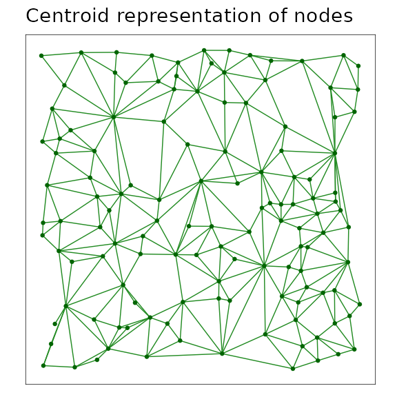
A minimum planar graph (MPG) shown with centroid node representation and linear link representation among these nodes.
Perimeter representation of links
Where the spatially-explicit nature of the connections among these nodes is important, perimeter representation of links and two-dimensional visualization of the nodes may be a useful technique.
Plotting the region covered by a node, and links as lines drawn between the perimeters of these regions is an efficient way to convey the topology of the network and which parts of a node are closest to its neighbours. It also signals that the linking of nodes was done from the perimeter rather than the centroid.
This example extends the previous one, where centroid representation of links was used.
## Plot the minimum planar graph using perimeter links
## and two dimensional nodes
figure13 <- plot(fragMPG, quick = "mpgPerimPlot", theme = FALSE) +
  ggtitle("Perimeter representation of links")
figure13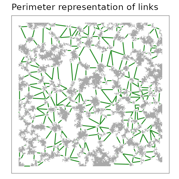
A minimum planar graph (MPG) with links represented from the perimeter of the patches (i.e., at the start and end points of spatially-explicit links). This rendering can simplify visualization.
Spatially-explicit representation of links
Spatially-explicit representation of the links implies both that the end points of links are on the perimeter of the region represented by the node, and that the predicted shortest paths among those node perimeters have coordinates. This approach conveys all available spatial information in the minimum planar graph. It also has the potential to mislead. Shortest paths between nodes are estimates of the shortest distance on the resistance surface and not necessarily of the route by which the process of interest actually flows. This kind of representation should therefore be used with appropriate caution.
However, using this visualization does efficiently communicate how the minimum planar graph model was constructed, and suggests which parts of the resistance surface may influence the pattern of the connections among nodes, both of which may aid in interpretation.
This example uses this same data as the previous one to permit comparison among visualizations.
## Plot the minimum planar graph using spatially-explicit links
## and two dimensional nodes.
figure14 <- plot(fragMPG, quick = "mpgPlot", theme = FALSE) +
  ggtitle("Spatially-explicit representation of links")
figure14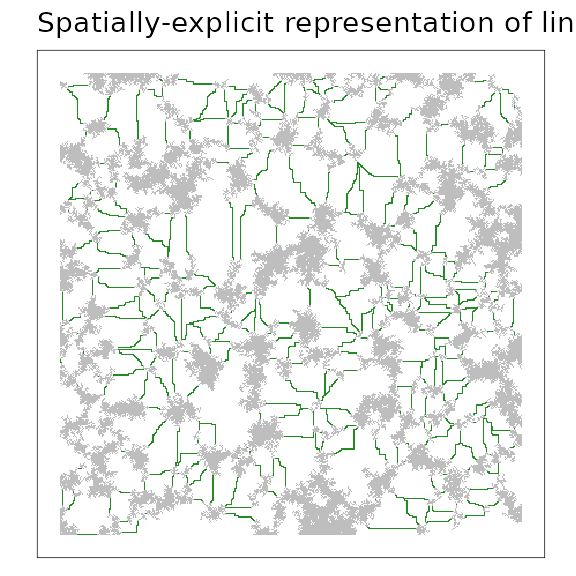
A minimum planar graph (MPG) with the shortest links among patch perimeters rendered as spatially-explicit paths. This rendering can help demonstrate the modelling procedure, but risks overinterpretation of the actual paths involved (see text).
Characteristics of nodes (weights)
Variables that are associated with a focal ecological process at a node can be represented on a network visualization. These variables are sometimes known as node “weights”. For example, where nodes represent regions such as patches of habitat or protected areas, a useful node weight may be the area of the region represented by the node. Equally, measures of node quality such as the area of core or edge habitat could be represented. Any metric that is associated with the node can be plotted at that node by varying the shape, size or colour of plotting symbol.
In this example, the area of the patch represented by the node is used to scale the size of the symbol plotted at the centroid of the node.
figure15 <- ggplot() +
  geom_segment(
    data = ggGS(fragMPG, "links"),
    aes(x = x1, y = y1, xend = x2, yend = y2),
    colour = "forestgreen"
  ) +
  geom_point(
    data = ggGS(fragMPG, "nodes"),
    aes(x = x, y = y, size = patchArea), colour = "darkgreen"
  ) +
  scale_size_area(max_size = 10, breaks = c(1000, 3000)) +
  ggtitle("Characteristics of nodes (weights)")
figure15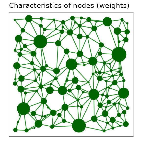
A minimum planar graph (MPG) with centroid node representation and links between centroids, where the plotted size of the node symbol has been scaled with the area of the patch it represents.
Characteristics of links (weights)
Variables associated with links, called link weights, often contain information on the modelled connectivity among nodes. Measures of interest in ecology can include the expected flow of organisms, or a variable correlated with this flow such as geographic distance or the distance of the shortest path across a resistance surface.
In this example, the length of the shortest path between patch perimeters is plotted by varying the width of the link connecting nodes. The link weight is found as a proportion of the Euclidean distance between those nodes. So, proportions higher than 1 imply a resistance to movement greater than expected by distance alone. On the scale used thinner lines describe a greater expectation of connectivity for an ecological process that is influenced by resistance (proportion closer to 1).
figure16 <- ggplot() +
  geom_segment(
    data = ggGS(fragMPG, "links"),
    aes(
      x = x1, y = y1, xend = x2, yend = y2,
      size = lcpPerimWeight / (sqrt((x2 - x1)^2 + (y2 - y1)^2))
    ),
    colour = "forestgreen", alpha = 0.5
  ) +
  scale_size(range = c(0, 3), breaks = seq(1, 6, by = 0.5)) +
  geom_point(
    data = ggGS(fragMPG, "nodes"),
    aes(x = x, y = y), size = 3, colour = "darkgreen"
  ) +
  ggtitle("Characteristics of links (weights)")
figure16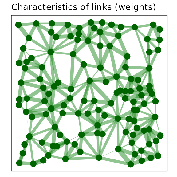
A minimum planar graph with centroid node and link representation where the width of the links has been scaled in proportion to the reduction in connectivity due to resistance. Wider links correspond to reduced connectivity.
Link thresholding by plotting
Removing links with weights that are greater than a threshold value is referred to as link thresholding and can be used to identify components, or connected sets of nodes (Urban and Keitt 2001; Galpern, Manseau, and Fall 2011). It is the most basic approach to scaling a network, and the technique upon which grains of connectivity is based (see later examples).
Here, we remove links greater than a threshold of 20.
This is measured in the units of the resistance surface. Thresholding at
this level implies we wish to remove all links that represent a
cumulative path distance on the resistance surface of 20 times the
dimension of a raster cell. The resulting components (also called
clusters) in the network identify groups of nodes that have a minimum
level of connectivity among them.
In the simplest approach to link thresholding, rather than
remove links from the network that are greater than this
threshold, we elect not to plot them. We do this by rendering longer
links as transparent (NA is the ggplot2 colour
specification for transparency).
This visualization may be useful to demonstrate which nodes are most strongly connected to one another. It does an adequate job of highlighting which groups of nodes are connected as a single component or cluster. However, we can do better. See the next example.
figure17 <- ggplot() +
  geom_raster(
    data = ggGS(fragMPG, "patchId"),
    aes(x = x, y = y, fill = value > 0)
  ) +
  scale_fill_manual(values = "grey") +
  geom_segment(
    data = ggGS(fragMPG, "links"),
    aes(
      x = x1, y = y1, xend = x2, yend = y2,
      colour = lcpPerimWeight > 20
    )
  ) +
  scale_colour_manual(values = c("forestgreen", NA)) +
  geom_point(
    data = ggGS(fragMPG, "nodes"),
    aes(x = x, y = y), colour = "darkgreen"
  ) +
  ggtitle("Link thresholding by plotting")
figure17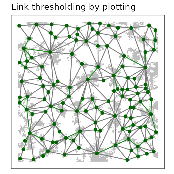
A link threshold representation of a minimum planar graph (MPG), where links connect the centroids of adjacent patches in the same component (cluster). Nodes that form their own component are shown as circles without links.
Link thresholding to show components
As noted in the last example, highlighting which nodes are connected into components (or clusters) after the network has been subjected to link thresholding can improve the visualization of connected regions of the map.
Here, grainscape::threshold() is used to remove links
longer than a certain length from the igraph model of the
landscape network. The igraph::components() function is
then called to label nodes by their membership in a particular component
(or cluster). We can then use this information to label the nodes by
their component membership. To improve the visualization, the nodes are
also plotted as large circles and the labels in a reverse colour. This
could also be done (perhaps more effectively) using a colour or shape
scale for node symbols that have been carefully selected to accentuate
patterns of interest in the figure.
## Use the grainscape::threshold() function to create a new network
## by thresholding links
fragTh <- threshold(fragMPG, doThresh = 20)

## Find the components in that thresholded network using
## an igraph package function
fragThC <- components(fragTh$th[[1]])

## Extract the node table and append the
## component membership information
fragThNodes <- data.frame(vertex_attr(fragTh$th[[1]]),
  component = fragThC$membership
)

## We don't want to show nodes that are in components with
## only one node, so remove them
singleNodes <- fragThNodes$component %in% which(fragThC$csize == 1)
fragThNodes <- fragThNodes[!(singleNodes), ]

## Rename some columns to improve readability
fragThNodes$x <- fragThNodes$centroidX
fragThNodes$y <- fragThNodes$centroidY

figure18 <- ggplot() +
  geom_raster(
    data = ggGS(fragMPG, "patchId"),
    aes(x = x, y = y, fill = value > 0)
  ) +
  scale_fill_manual(values = "grey") +
  geom_segment(
    data = ggGS(fragMPG, "links"),
    aes(
      x = x1, y = y1, xend = x2, yend = y2,
      colour = lcpPerimWeight > 20
    )
  ) +
  scale_colour_manual(values = c("forestgreen", NA)) +
  geom_point(
    data = fragThNodes,
    aes(x = x, y = y), shape = 19, size = 4, colour = "darkgreen"
  ) +
  geom_text(
    data = fragThNodes, aes(x = x, y = y, label = component),
    colour = "white", size = 2
  ) +
  ggtitle("Link thresholding to show components")
figure18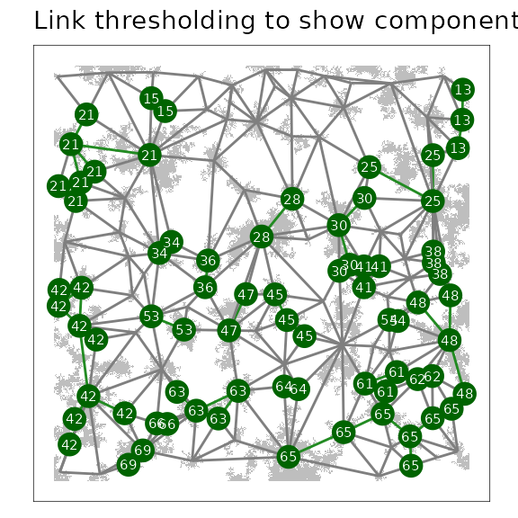
A link threshold representation of a minimum planar graph (MPG), where links connect the centroids of adjacent patches in the same component (cluster). Nodes that are part of a component are labelled with their component membership.
Analysis
Network metrics to assess node importance
There are numerous network metrics available that describe properties
of nodes and network topology. The igraph package used by
grainscape implements a selection of these metrics. A
simple and intuitive node-based network metric is degree. This
is a count of the number of links adjacent to a node. A node with a
higher degree, then, might be deemed as contributing more to
connectivity. The usefulness of this metric depends on the application,
and more sophisticated measures of node importance such as
centrality may be more appropriate. These are also available in
igraph. However caution is appropriate, as the MPG is
itself an approximation of all possible links among nodes. Please see
Galpern, Manseau, and Fall (2011) for more
information on this limitation.
Here we demonstrate how to calculate degree using the
igraph package and visualize the result of this simple
network analysis. We calculate degree on a link thresholded network,
implying that there is a maximum level of link resistance above which we
do not consider that link as making a contribution to a node’s
connectivity.
## Assess degree on the nodes of a thresholded network
## made in the previous example (threshold = 20)
fragThDegree <- degree(fragTh$th[[1]])

## Add degree to the node table
fragThNodes <- data.frame(vertex_attr(fragTh$th[[1]]), degree = fragThDegree)

## Remove nodes with a degree of 0
fragThNodes <- fragThNodes[fragThNodes$degree > 0, ]

## Rename some columns to improve readability
fragThNodes$x <- fragThNodes$centroidX
fragThNodes$y <- fragThNodes$centroidY

figure19 <- ggplot() +
  geom_raster(
    data = ggGS(fragMPG, "patchId"),
    aes(x = x, y = y, fill = value > 0)
  ) +
  scale_fill_manual(values = "grey") +
  geom_segment(
    data = ggGS(fragMPG, "links"),
    aes(
      x = x1, y = y1, xend = x2, yend = y2,
      colour = lcpPerimWeight > 20
    )
  ) +
  scale_colour_manual(values = c("forestgreen", NA)) +
  geom_point(
    data = fragThNodes,
    aes(x = x, y = y, size = degree), colour = "darkgreen"
  ) +
  ggtitle("Node importance metrics (degree)")
figure19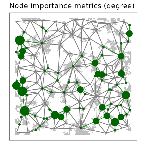
A link threshold representation of a minimum planar graph (MPG), where nodes, plotted at patch centroids, are scaled in proportion to the degree of the node (i.e., the number of links adjacent on the node). Larger circles indicate nodes with a higher degree in the MPG.
Shortest-path distance between nodes
Finding the shortest path through the network from a source to a destination node and the length of that path is a useful prediction of the network model and has many applications (Zeller, McGarigal, and Whiteley 2012; Galpern, Manseau, and Wilson 2012; Adriaensen et al. 2003) . It gives an expected distance through the network, taking into account the modelled connectivity among nodes.
This example illustrates how to use igraph functions to
find the shortest path through the network, calculate its length in the
metric of the resistance surface, and visualize the path.
The plot uses links between patch centroids and recolouring of the patch raster to add emphasis. If we were to use a link thresholded network, here, (which we will not for simplicity), the entire network would not be completely connected, so certain patches may not have a shortest path between them. Finding shortest paths on thresholded networks may still be a useful technique, and the absence of a shortest path an important finding.
## Declare the start and end patchIds
## These were identified by plotting the patchIds (see earlier examples)
startEnd <- c(1546, 94)

## Find the shortest path between these nodes using
## the shortest path through the resistance surface
## (i.e. weighted by 'lcpPerimWeight')
shPath <- shortest_paths(fragMPG$mpg,
  from = which(V(fragMPG$mpg)$patchId == startEnd[1]),
  to = which(V(fragMPG$mpg)$patchId == startEnd[2]),
  weights = E(fragMPG$mpg)$lcpPerimWeight,
  output = "both"
)

## Extract the nodes and links of this shortest path
shPathN <- as.integer(names(shPath$vpath[[1]]))
shPathL <- E(fragMPG$mpg)[shPath$epath[[1]]]$linkId

## Produce shortest path tables for plotting
shPathNodes <- subset(ggGS(fragMPG, "nodes"), patchId %in% shPathN)
shPathLinks <- subset(ggGS(fragMPG, "links"), linkId %in% shPathL)

## Find the distance of the shortest path
shPathD <- distances(fragMPG$mpg,
  v = which(V(fragMPG$mpg)$patchId == startEnd[1]),
  to = which(V(fragMPG$mpg)$patchId == startEnd[2]),
  weights = E(fragMPG$mpg)$lcpPerimWeight
)[1]

## Plot shortest path
figure20 <- ggplot() +
  geom_raster(
    data = ggGS(fragMPG, "patchId"),
    aes(
      x = x, y = y,
      fill = ifelse(value %in% shPathN, "grey70", "grey90")
    )
  ) +
  scale_fill_identity() +
  geom_segment(
    data = shPathLinks, aes(x = x1, y = y1, xend = x2, yend = y2),
    colour = "forestgreen", size = 1
  ) +
  geom_point(data = shPathNodes, aes(x = x, y = y), colour = "darkgreen") +
  ggtitle("Shortest-path distance between nodes") +
  annotate("text", 260, 340,
    label = paste0(shPathD, " resistance units"), size = 2.5
  )
figure20patchId. Links and nodes that form part of
this”corridor” are highlighted.” width=“288” />
The shortest path through a minimum planar graph (MPG) given a start and
end patchId. Links and nodes that form part of this
“corridor” are highlighted.
Pairwise distances between a set of nodes can be found using the
igraph::distances() function as follows.
## Create a pairwise table of shortest path distances among nodes using
## the resistance surface based links
allShPathD <- distances(fragMPG$mpg, weights = E(fragMPG$mpg)$lcpPerimWeight)

## Create a table for the first 8 nodes
tableD <- allShPathD[1:8, 1:8]
tableD[upper.tri(tableD)] <- NA
dimnames(tableD)[[1]] <- paste("patchId", dimnames(tableD)[[1]], sep = " ")

kable(tableD)| 7 | 10 | 12 | 13 | 19 | 23 | 27 | 52 | |
|---|---|---|---|---|---|---|---|---|
| patchId 7 | 0 | |||||||
| patchId 10 | 398 | 0 | ||||||
| patchId 12 | 405 | 65 | 0 | |||||
| patchId 13 | 419 | 95 | 30 | 0 | ||||
| patchId 19 | 454 | 130 | 65 | 35 | 0 | |||
| patchId 23 | 27 | 371 | 378 | 392 | 427 | 0 | ||
| patchId 27 | 534 | 210 | 145 | 115 | 80 | 507 | 0 | |
| patchId 52 | 90 | 488 | 495 | 509 | 544 | 117 | 624 | 0 |
Scaling landscape networks
Modeling
Scaling resistance surfaces (lattice grains of connectivity)
Resistance surfaces produced from remotely-sensed land cover or elevation data may be too fine-scaled for the process being modelled. By having a scale that is mismatched with the one of interest, the signal or pattern may be obscured (Cushman and Landguth 2010). A common strategy is to upscale these rasters and remove potentially unimportant variation by coalescing adjacent raster cells and representing these by their mode or mean. Another approach uses moving windows to smooth out variation (Galpern and Manseau 2013a).
grainscape enables a different approach to upscaling a
resistance surface based on remotely-sensed data. Lattice grains of
connectivity drops a lattice of focal points (or nodes), finds the
minimum planar graph and its complementary Voronoi polygons on the
resistance surface among these points, and then coalesces adjacent
Voronoi polygons using the graph as guidance. It can be classified as a
model-based approach to upscaling (where the model is the resistance
surface, and its representation of some ecological or geographical
process). Unlike arbitrarily upscaling a raster based on cell-proximity,
this approach uses spatial information in the surface itself. The grid
spacing of the lattice as well as the amount of link thresholding
together influence the amount of upscaling that occurs.
This example uses the familiar resistance surface of previous
examples. It specifies a lattice grid spacing of 25 cells.
We use grainscape grains of connectivity analysis functions
to coalesce Voronoi polygons at 5 thresholds or scales. We
could examine the resulting lattice grains of connectivity at any of
these five scales. We choose the third to illustrate an intermediate
level of scaling.
## Extract a minimum planar graph and complementary
## Voronoi polygons from the fragmented resistance surface
## Note the use of an integer for the 'patch' parameter, which
## specifies the spacing in cells of the lattice grid
fragLatticeMPG <- MPG(fragRes, patch = 25)

## Extract grains of connectivity from this MPG at
## five link thresholds (or scales)
fragLatticeGOC <- GOC(fragLatticeMPG, nThresh = 5)

## Visualize the Voronoi polygons at the third threshold
figure21 <- plot(grain(fragLatticeGOC, whichThresh = 3),
  quick = "grainPlot", theme = FALSE
) +
  ggtitle("Lattice grains of connectivity")
## Extracting voronoi boundaries...
figure21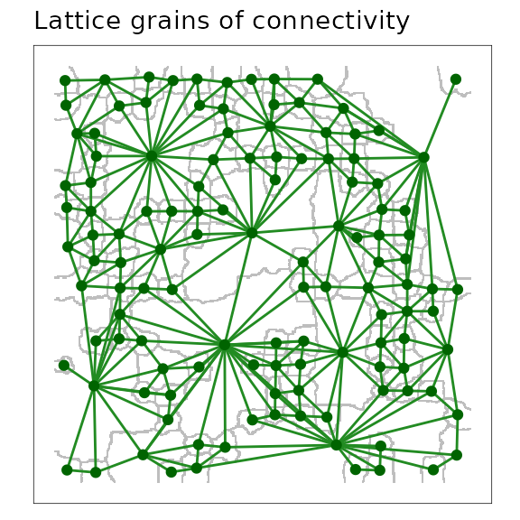
A scaled lattice grains of connectivity (GOC) model showing the outline of Voronoi polygons in grey, and the network connections among polygons as links plotted from adjacent polygon centroids.
Scaling networks with two-dimensional nodes (patch grains of connectivity)
Patch grains of connectivity extends the idea of the point nodes in the lattice model to two-dimensional node regions (Galpern, Manseau, and Wilson 2012). It leverages the minimum planar graph demonstrated in previous examples and its complement the Voronoi tessellation of the resistance surface. Voronoi polygons are identified and coalesced at different thresholds or “grains” in these models.
A key contribution is the capacity to model landscape connectivity at multiple spatial scales, and to account for uncertainty in the nature of the patch and the surrounding matrix (Galpern, Manseau, and Wilson 2012; Galpern and Manseau 2013a). The use of polygons rather than discrete two dimensional nodes (i.e., surrounded by a matrix that presents resistance) allows for uncertainty in patch definition. Such an approach may be particularly valuable in ecology for modelling landscape connectivity in highly-mobile terrestrial animals, for which both patch definition and resistance surface parameterization have large amounts of uncertainty.
The product is a continuously distributed set of two-dimensional nodes, such that every point on the surface is associated with a node. Critically these polygons can be scaled. Relationships among these polygons are based on the relationships among two-dimensional nodes contained within. In a later example we show how grains of connectivity can be used to identify potential spatial corridors between points.
This patch grains of connectivity model uses the familiar resistance
surface and the same patches (=1) used in many earlier
examples.
## Use the MPG extracted in previous examples to find a
## patch grains of connectivity model, where patches
## are cells on the resistance surface equal to 1
## Do this at five thresholds
fragPatchGOC <- GOC(fragMPG, nThresh = 5)

## Plot the fourth grain
figure22 <- plot(grain(fragPatchGOC, whichThresh = 4),
  quick = "grainPlot", theme = FALSE
) +
  ggtitle("Patch grains of connectivity")
## Extracting voronoi boundaries...
figure22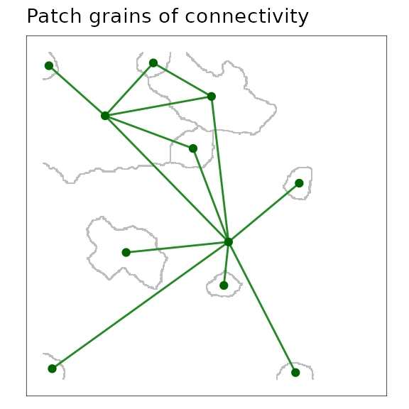
A scaled patch grains of connectivity (GOC) model showing the outline of Voronoi polygons in grey, and the network connections among polygons as links plotted from adjacent polygon centroids.
Visualization
Characteristics of grains of connectivity
The Voronoi polygons that are complementary to a given scale or
threshold of a landscape network describe a geographic area. As polygons
are coalesced and the network is scaled, grainscape
collects summary statistics on several variables in the newly aggregated
areal units. These include the total area and core area of
two-dimensional nodes that fall within the boundary of the polygon, the
median link weight within the cluster, and several others.
Visualizing these quantities at multiple spatial scales (i.e., grains) can support a sensitivity analysis for the area or connectivity of sub-regions in the model. For example, to assess the availability of connected habitat or protected areas, or the risks to the functioning of these elements.
The following example maps the amount of core area of patches at an intermediate scale by varying the size of symbols plotted at the centroids of the Voronoi polygons. Core area is defined as the area of all patches in the polygon excluding the edges of those patches, which consists of a one-cell wide margin. In this resistance surface node core area appears to be correlated generally with the size of the Voronoi polygon (i.e., larger node circles appear in larger polygons)
## Put the fourth grain of the GOC model into its own object
fragPatchGrain4 <- grain(fragPatchGOC, whichThresh = 4)

figure23 <- ggplot() +
  geom_raster(
    data = ggGS(fragPatchGrain4, "vorBound"),
    aes(x = x, y = y, fill = ifelse(value > 0, "grey", "white"))
  ) +
  scale_fill_identity() +
  geom_segment(
    data = ggGS(fragPatchGrain4, "links"),
    aes(x = x1, y = y1, xend = x2, yend = y2), colour = "forestgreen"
  ) +
  geom_point(
    data = ggGS(fragPatchGrain4, "nodes"),
    aes(x = x, y = y, size = totalCoreArea), colour = "darkgreen"
  ) +
  ggtitle("Voronoi polygon metrics (core area)")
## Extracting voronoi boundaries...
figure23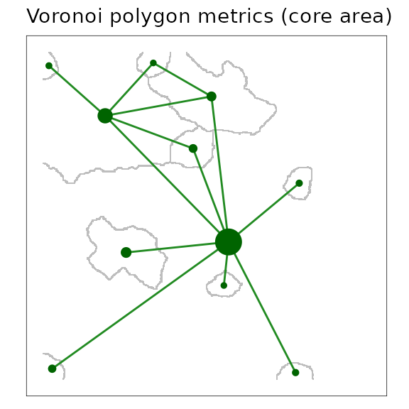
A scaled patch grains of connectivity (GOC) model showing the outline of Voronoi polygons in grey, and the network connections among polygons. Node symbols have been scaled in proportion to the core area of patches (i.e., area excluding edge) contained within the Voronoi polygon.
Analysis
Corridor analyses at multiple scales
Finding the shortest path through a grain of connectivity is conceptually identical to finding the shortest path between nodes in the minimum planar graph. The key difference is that use of a grain permits the scaling of the network. Links between Voronoi polygons in a grain are selected links between components or clusters on the minimum planar graph. In a minimum planar graph we cannot find a shortest path between nodes that are disconnected, but with a grains of connectivity model the goal is rather to find the shortest path between these disconnected components (represented by Voronoi polygons). The links connecting polygons are the shortest of all those that span patches in two components.
An application of grains of connectivity is to scale a corridor
analysis, effectively to find a shortest path between two locations on
the map and understand how sensitive this path may be to the scale. In
this example, we use the grainscape function
corridor() to identify and plot this corridor. Because
grains of connectivity are continuously distributed across the map we do
not need to provide a focal node or patch identifier. Rather, we pass
coordinates to the function.
## Set coordinates for the start and end of the corridor
startEnd <- rbind(c(5, 180), c(395, 312))

fragCorridor3 <- corridor(fragPatchGOC, whichThresh = 3, coords = startEnd)

## Use the default plotting functionality for corridor objects
figure24 <- plot(fragCorridor3, theme = FALSE) +
  annotate("text",
    x = startEnd[1, 1], y = startEnd[1, 2] - 20,
    label = "START", colour = "red", size = 2
  ) +
  annotate("text",
    x = startEnd[1, 1], y = startEnd[1, 2],
    label = "X", colour = "red", size = 2
  ) +
  annotate("text",
    x = startEnd[2, 1], y = startEnd[2, 2] + 20,
    label = "END", colour = "red", size = 2
  ) +
  annotate("text",
    x = startEnd[2, 1], y = startEnd[2, 2],
    label = "X", colour = "red", size = 2
  ) +
  annotate("text",
    x = 250, y = 400,
    label = paste0(
      "Corridor length: ",
      round(fragCorridor3@corridorLength, 0),
      " resistance units"
    ), size = 2
  ) +
  ggtitle("Corridor analysis; grain of connectivity")
## Extracting Voronoi boundaries...
figure24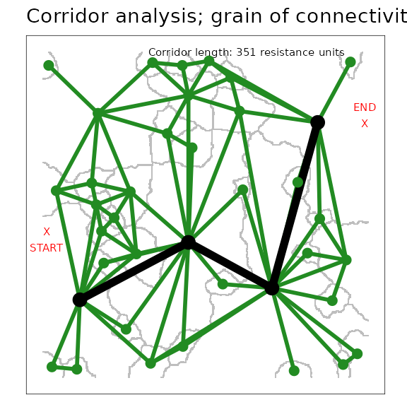
A corridor through a scaled patch grains of connectivity (GOC) model.
The black nodes and links demonstrate the corridor between the polygons
containing the start and end points (plotted in red as X).
Green nodes and links show the remainder of the grains of connectivity
network.
Modeling
Distances between polygons at multiple scales
grainscape provides functions to automate corridor
analyses at multiple scales (grains), and for multiple points on the
map. The products are distance matrices.
In this example, the grain depicted in the previous corridor analysis
is used to find the pairwise shortest path distances between eight
randomly positioned points. Distances at all of the grains that are
available in the GOC object are produced. However, the
table that appears below shows distances for only this grain.
## Create eight random points on the map
pts <- cbind(sample(seq_len(ncol(fragRes)))[1:8], sample(seq_len(nrow(fragRes)))[1:8])

## Plot these points and the grains of connectivity network
figure25 <- plot(grain(fragPatchGOC, 4), quick = "grainPlot", theme = FALSE) +
  annotate("text", x = pts[, 1], y = pts[, 2], label = 1:8, colour = "red") +
  ggtitle("Eight points for pairwise distances")
## Extracting voronoi boundaries...
figure25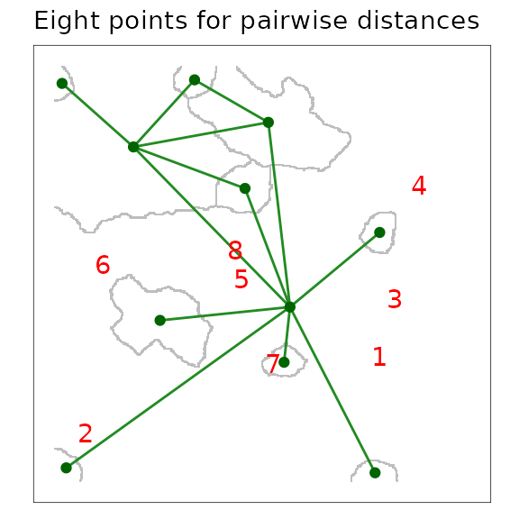
A scaled patch grains of connectivity (GOC) model showing the outline of Voronoi polygons in grey, and the network connections among polygons as links plotted from adjacent polygon centroids. The locations of eight focal points used to calculate a pairwise distance matrix are plotted in red.
## Find the pairwise distances between them at all grains
## available in the GOC object created earlier
ptsD <- grainscape::distance(fragPatchGOC, pts)

## Extract distances for the grain of interest (4)
ptsD2 <- ptsD$th[[4]]$grainD

## Prepare this distance matrix for printing
ptsD2[upper.tri(ptsD2)] <- NA
ptsD2 <- round(ptsD2, 1)
dimnames(ptsD2)[[1]] <- paste0(
  "Point ", 1:8, " (Polygon ",
  dimnames(ptsD2)[[2]], ")"
)
dimnames(ptsD2)[[2]] <- 1:8

kable(ptsD2)| 1 | 2 | 3 | 4 | 5 | 6 | 7 | 8 | |
|---|---|---|---|---|---|---|---|---|
| Point 1 (Polygon 2) | 0.0 | |||||||
| Point 2 (Polygon 2) | 0.0 | 0.0 | ||||||
| Point 3 (Polygon 2) | 0.0 | 0.0 | 0.0 | |||||
| Point 4 (Polygon 2) | 0.0 | 0.0 | 0.0 | 0.0 | ||||
| Point 5 (Polygon 2) | 0.0 | 0.0 | 0.0 | 0.0 | 0.0 | |||
| Point 6 (Polygon 2) | 0.0 | 0.0 | 0.0 | 0.0 | 0.0 | 0.0 | ||
| Point 7 (Polygon 9) | 180.8 | 180.8 | 180.8 | 180.8 | 180.8 | 180.8 | 0.0 | |
| Point 8 (Polygon 2) | 0.0 | 0.0 | 0.0 | 0.0 | 0.0 | 0.0 | 180.8 | 0 |